
The Solution Effect Diagram is a very useful variation of the Ishikawa diagram. It is used for exploring the potential implications to an intended change (sometimes referred to as ‘Impact Analysis’). The intended change or solution is written in the box (on the left-hand side). The legs of the diagram are then used to explore the potential implications (good and bad) of implementing that solution.
 The legs can be labeled in order to draw out a balanced, comprehensive exploration. For example using different stakeholder groups, or different aspects of the business such as: People; Performance; Security; Finance – whatever seems appropriate. Typically positive impacts can be added in a green pen, and potential negative impacts in a red pen.
This helps people think through the potential consequences of change, and to plan for them: maximising and leveraging the positives, and avoiding or mitigating the negatives. As with the normal Fishbone, it is useful to prioritise where you will focus your attention within it, rather than try and do everything – you can use sticky (or virtual) dots to do this.
For small groups, it may be best to allow people to stick their thoughts where they wish (in post-it notes of the appropriate colour for physical environments, or fonts of the appropriate colour for on-line whiteboards). After a few minutes, review the quality of what is being put up: Is the meaning of each contribution clear, and are all areas being considered? Flag up any such issues for the team to correct, and then continue until the main thoughts have been drawn out. Then group similar ideas.
For larger groups, you may find it beneficial to split them up to look at different areas of the chart, and then bring them together to review the overall result.
To prioritise the contributions for attention, agree with the group what criteria they will use for prioritisation (for example ease and impact of doing something in that area) and then give them a limited number of ‘dots’ each to vote for where the groups attention should be best focused in ensuring success in implementation.
You can also use multiple solution effect diagrams to compare a number of different potential solutions by better exploring the implications of each before making a final decision on which to select.
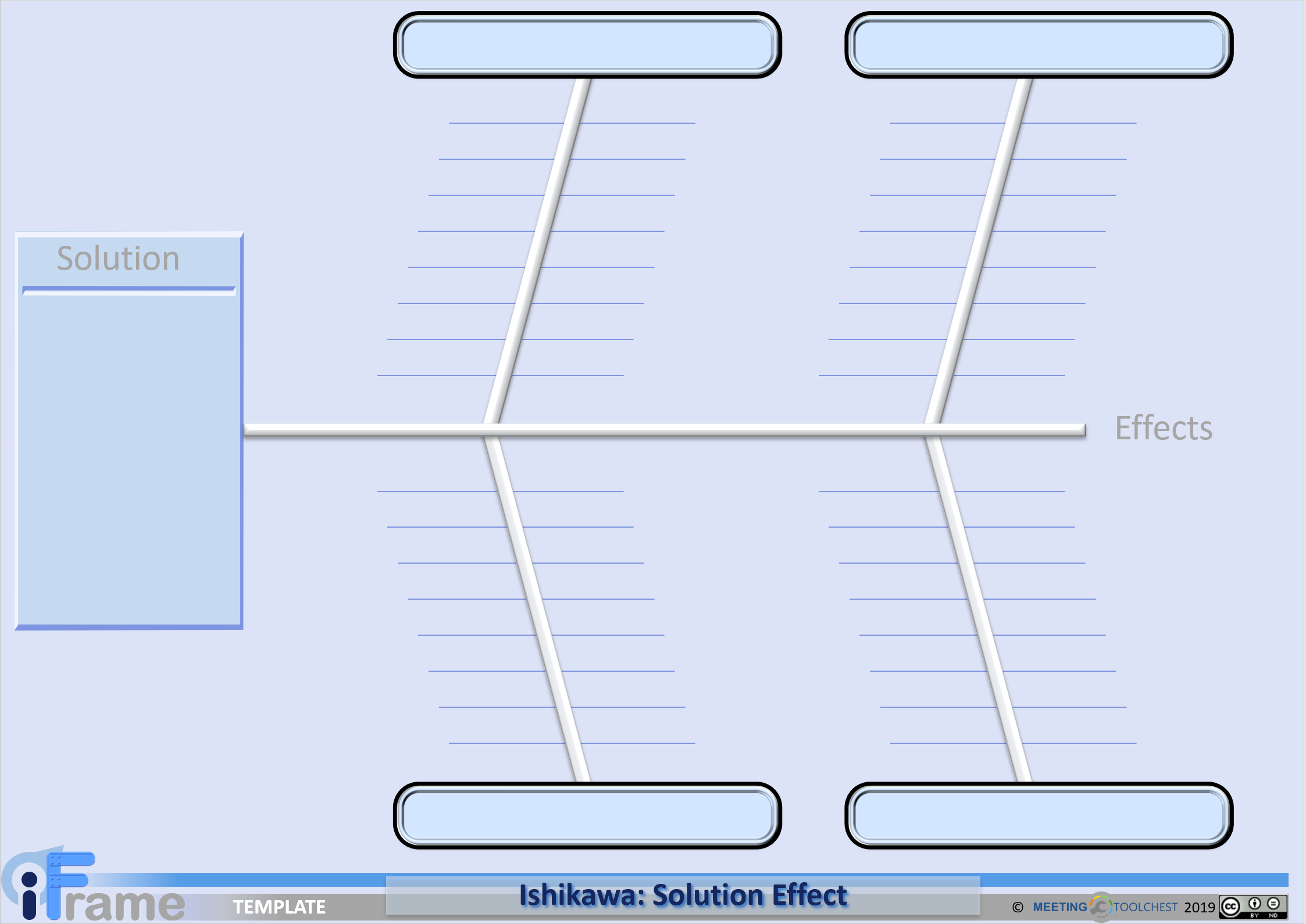
You can copy a template for the solution effect diagram below. This can be placed on an electronic whiteboard for virtual meetings, or blown up as A1/A0 size for physical meetings (but the design is simple enough that it can quickly be drawn from scratch).
If it would help to have some simple instructions for you and your group to work through, you can find these below:
Objective: To gain a comprehensive and shared picture of the potential implications of this change or solution
- Draw up or stick up a solution effect template
- Write down the intended change in the box at the left hand side
- Work with the group to define the key areas or groupings that the change will impact, and write these at the end of each leg
- Invite people to add sticky notes (physical or virtual) on each leg to list out the possible different impacts (green for good, red for bad)
- Ensure everyone can understand all the sticky notes – if not, ask the writer to clarify
- Group similar sticky notes if there are any
- Ask if the group feels there is a need to do something as a result of the diagram, and if so:
- Prioritise those sticky notes which people feel there is something that needs to be done (to improve the success of the change)
- Agree who will be doing what about the priority items

Right-click template image and select Copy Image or Save Image as …
Solution Effect Diagram Template: As PowerPoint | As png image
Track your progress to ensure the efficacy of this strategy.